The graphics are not very good-- you've got mixtures of images of various resolutions, that just don't fit together at all.
For example:

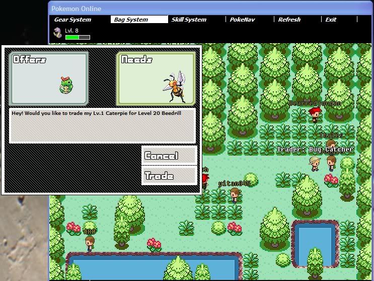
Parts of this image are from blown up compressed images(top left text), while some are intact in their tiny sprite form-- it looks extremely sloppy. There's also a lot of wasted empty space that looks very awkward.
Another example:
All of the interface looks odd, because none of it fits with anything else-- the HUD is simply lazy italic text. The character sprites are also not very good-- and higher-resolution than the backgrounds they're walking around on.
EDIT: Try not to use so many fonts-- I would suggest using the fonts used in the pokemon games, or at least try to be more consistent, it will look much better

It's a great concept and I hope it works out for you
EDIT2: I just looked at the screens on your website, and the battle system is by far the slickest interface I've seen so far-- you should be showcasing that! (though you've got to get some
original backgrounds for battles)
